AcTVty
Building intimate connections via synchronized video streaming.

INDUSTRIES
Streaming Networks
Movies/TV
Social Media
ROLES
UX Researcher
UX Designer
Visual Designer
TIMELINE
8 Months
UX RESEARCH
Desk Research
Competitive Review
Qualitative Interviews
Affinity Diagram
Personas
User Stories
Usability Tests
UX DESIGN
Sketching
Wireframing
Screen Flow
Prototyping
VISUAL DESIGN
Mood Board
Style Guide
Hi-Fi Mockups
Problem: Streaming TV is convenient and fun! But sometimes, it can feel lonely...
It's November 2019. The "Streaming Wars" are gaining momentum as Disney throws its hat into the ring, pulling lots of its content from competitors and offering it themselves at the touch of a few buttons. With the rise of streaming services, however, watching TV has become a lonely experience for many viewers.
Months later, the COVID-19 pandemic begins, isolating the world into their home. Mental health issues rise, and loneliness emerges as an even bigger problem. In this climate, streaming viewers have been turning to Zoom, Netflix Party, and other apps to share in the experience of streaming their movies while sheltering in place.
How might we help viewers feel more connected while streaming TV and movies?
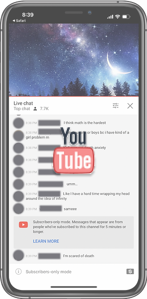
Competitive review of mobile apps: Potential users have already been making the most of competitors' audio, chat, and comments features to connect before, during, and after watching shows.


Discovery research: 10 semi-structured qualitative interviews with social viewers.
Key insight: Social viewing makes movies more enjoyable and strengthens friendships, improving mood and productivity.
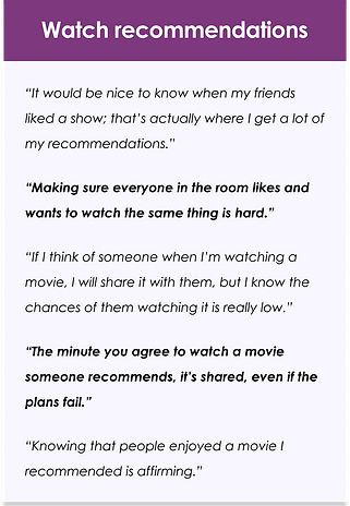
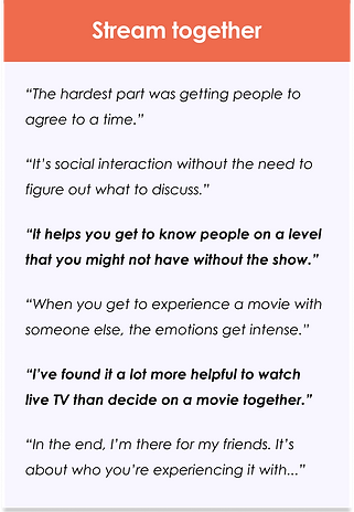
Affinity diagram: Social viewers love watching movies their friends recommend and talking about them right away, but it can be tough to figure out the logistics.

DEFINE
With this data, I defined two main types of user personas. "Communal Carol" is the primary user. She's all about building intimate relationships, and picking the right movie, community, and viewing experience is key to strengthening her relationships.

Compatibly, "Gregarios Greg" is the man who's always down for bonding with his friends and making unforgettable memories. He'll definitely be at the next watch party, but he'll probably be running late from another hangout, so he doesn't want to have to spend too much time figuring out logistics.
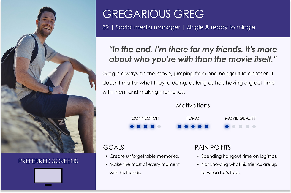
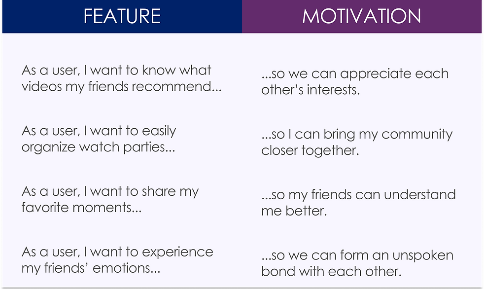
With these personas in mind, it came time to brainstorm some solutions to their pain points. Afterward, I organized them into User Stories and prioritized them based off of both personas' goals and pain points.
IDEATE
The toughest challenge was iterating a solution that helped Carol find the perfect movie and time for everyone and while also minimizing the work for Greg and other guests to easily watch with their friends.
To tackle this challenge, I conducted 5 usability tests at each stage (sketches, wireframes, mockups), measuring ease of use for users trying to watch recommended movies and TV shows with their friends.
PHASE I: TESTING SKETCHES
PROS:
-
Easier planning for Carol, who's willing to work harder.
-
Guests like Greg have all the details for the watch party to just show up and have a good time.
CONS:
-
Confusing IA - "Shouldn't you get notified when someone recommends a movie?"
-
Decision paralysis when entering scheduling details.


PHASE II: TESTING WIREFRAMES
PROS:
-
More intuitive IA.
-
Less options made it easier to use.
CONS:
-
Bored by uniform list.
-
Difficulty finding relevant info in long list.


Carol has all the info she needs to evaluate a movie if she still wants to schedule a watch party at a later time.
PHASE III:
SCHEDULE-FREE STRATEGY
IN LO-FI MOCKUPS
Recommended movies are easy to find. Carol and Greg can start watching with friends immediately. No planning needed!

The other major challenge had been balancing the fact that users want to watch the movie while meaningfully socializing. While conducting the aforementioned usability tests at each stage, I also focused on understanding users' attitudes toward the social features to learn what felt most meaningful to them.
PHASE I: TESTING MULTIPLATFORM VIEWING
STRATEGY:
-
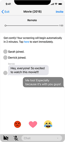
Initial sketches offer a host of socializing options that competitors have, but also include emojis for quick communication.
TEST RESULTS:
-
Users generally shared emotions with emojis, elaborating in text or via audio if needed.
-
Users were concerned they'd miss messages when focused on the screen.

.png)
PHASE II: TESTING COLOR CHANGING REACTS
STRATEGY:
-
Since emojis tested well, subsequent iterations made them easier to reach, brighter, and consolidated into less options.
-
Color changing screens with emoji reacts are easier to spot from afar.
TEST RESULTS:
-
Users liked the idea of color changing screens, but didn't understand what colors corresponded to each react.
PHASE III: EMOJI ANIMATIONS
Since the color changing feature wasn't intuitive enough, I decided to try a clear, noticeable animation for the emojis. In usability tests, users visibly enjoyed the animation without confusion!


PROTOTYPE
The final flow highlights recommendations and reduces the logistics needed to share the viewing experience to as little as 4 quick steps.

Mood board and style guide evoke a warm, intimate night in--a simple, but intentional gathering.

Yellow CTAs make it easy for Carol and Greg to start or join watch parties and quickly bond with friends.

Accessible CTAs and default options mitigate decision paralysis.
Carol’s guests, like Greg, join the watch party in a few, intuitive taps.


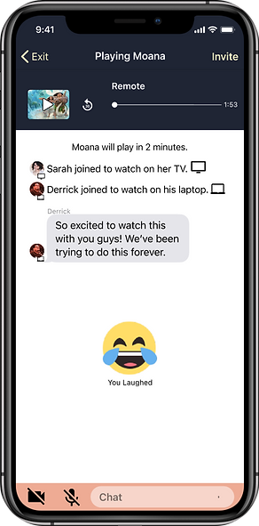
Animated reacts encourage users to share their favorite moments and helped them experience each other's emotions, fostering an unspoken bond with their friends.


